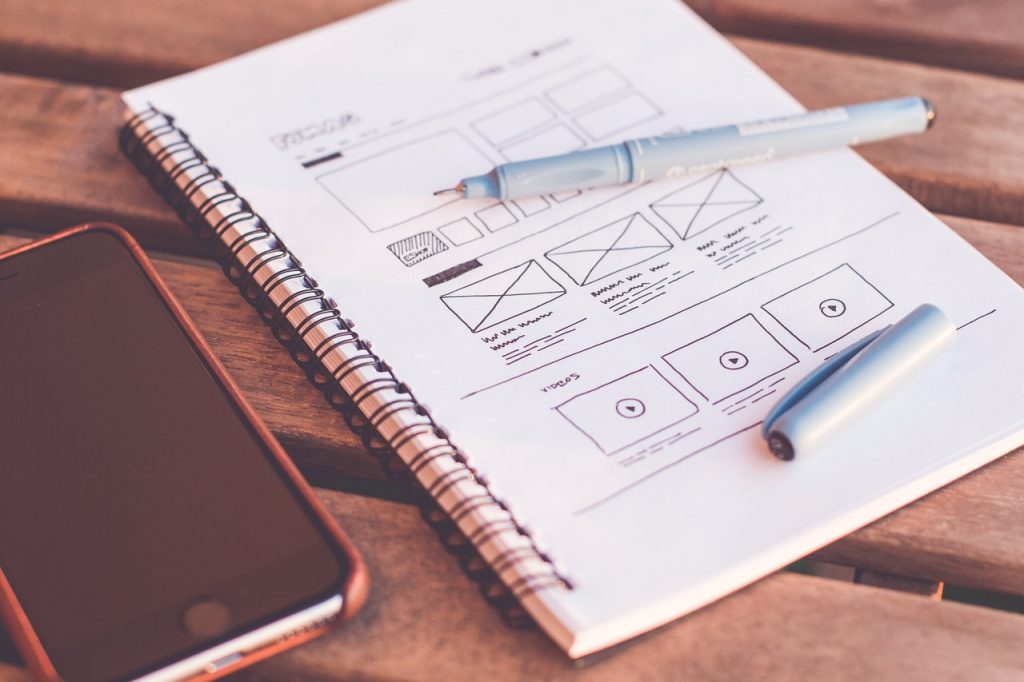
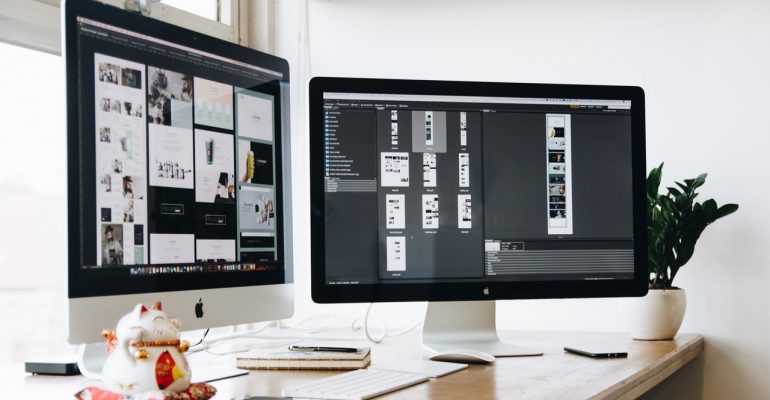
Designing an effective user interface for a website may seem simple on the face of it. After all, all you need is to display information, make it navigable, and keep the site available, right?
Any web designer knows that there’s a lot more than that going on under the surface. Setting aside coding skills, an effective UI requires designers to look at things from both sides — understanding how to make the site function at its highest level, while also anticipating the needs of the audience and figuring out how the site can be easily used.
Here are six simple tips to help you tackle the second part of the problem more effectively.
Know Your Audience
If you have to start from square one with a complicated issue that just increases the complication. However, if you start on level three of ten, you’re that much closer to the solution. That’s how it works with a website audience, too. For example, let’s say that you’re designing a site that sells items that are targeted at a senior market. Now, we all know some grandparents who are just as fluent in technology as their grandchildren, but the majority of them may have more difficulty with complicated UI. So keeping the layout simple and keeping clicks to a minimum is the best way to build your site from their starting level.
Now, let’s say that you’re crafting a site that is focused on highlighting design and marketing trends for online brands. You can probably expect that your average visitor will be conversant with the terms associated with those markets, as well as having some knowledge of web design. So you won’t have to focus on explaining those beginner-level terms or cater to
beginner-level needs — you can get straight to the important stuff without worrying about alienating your audience.
Knowing who you are targeting is an important factor in creating a user interface that propels the visitor to the next step, without getting bogged down.
Focus on Simplicity
We like simple things. We’re drawn to clean layouts, design which allows plenty of white space so individual elements can breathe, and sites that don’t overload or overwhelm us with too much going on.
If you like something as a web user, you can be pretty sure that other internet surfers will like it, too.
A simple UI gets rid of the unnecessary elements, things that are extraneous and won’t be used. This allows your visitor to focus on what really matters, their original purpose for visiting the site.
Simplicity and focus in your UI design puts you and your visitor on the same side. It tells your visitor that you value his or her time, and that you don’t want to waste it.
Being able to sense that respect in the UI itself will increase its effectiveness.
Follow Common Design Hierarchy and Layouts
We’re not saying that you should never think outside the box. After all, you want your site to be a stand-out, not just something that looks like, well, everything else out there.
But that doesn’t mean that you have to throw all design trends and traditions out the window and start from scratch.
In the interest of creating a user-friendly UI, in fact, holding to some expected design features is a good idea. For example, navigation trends tend towards placing the navigation along the top of the page, or along the left-hand side in a bar. There’s no rule that says these are the only two options, but since they have been the traditional choices for as long as websites have been around, that’s what the user tends to look for. If they don’t find the nav in those areas, they may get frustrated, feel that they’re spending more time than they want to look for simple options, and may even end up leaving if they feel they can’t effectively navigate the site.
A high bounce rate is a clear sign of an ineffective UI.

How you lay your site out can also increase the usefulness of your UI. Research tells us how people tend to read sites from left to right, the same way they read a book. So their eye is immediately drawn to the top left corner.
When designing for a cannabis or marijuana website, for example, design in an F shape will allow you to work along with that tendency, giving them the most important information in a logo at the top left corner, a header along the top, a nav bar or options down the left-hand side, and bold or larger print to draw attention to important information further down the page.
When branding your website follow similar rules and apply to your design and interface points. Getting a font based logo will only work congruously with your branding if you use the logo colours to match with your brand message and layout design.
Stay On Top of Problems
Another tip for creating and maintaining effective UI is to work at it continually. The needs of your audience will change over time. The features of the site, then, must also change, adapting to those needs.
This means:
- Being aware of design trends, and figuring out which ones should be included in your site.
- Staying up to date on adaptive sites and web accessibility guidelines.
- Asking for and paying attention to feedback. If someone points out a problem or a weak spot, take action.
- Being adaptable on every level.
A great user interface isn’t the easiest thing to achieve — but it is one of the best ways to ensure that your audience visits your site over and over again. By keeping your site simple, tailored to your audience, and easy to use, you can keep your UI as user-friendly — and effective — as it gets.
Blogger Profile
Michelle Richards loves to chew on words, graphic design and bubble gum. Her writing reflect all this combination – practical, aesthetical, and fun. She also likes to explore technical topics such as web development, and gadget reviews.


